
Project in few words
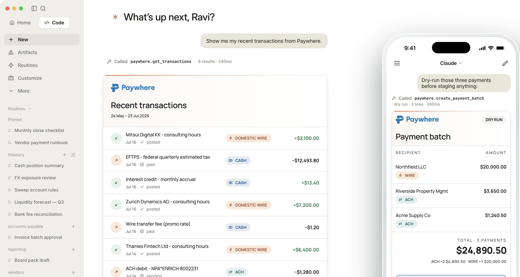
Paywhere builds programmable banking for banks and credit unions. Its product puts a bank inside AI assistants like Claude: a business customer asks for a balance or transactions, and the assistant can prepare a batch of payments the customer approves before any money moves. Each bank offers it under its own brand. Paywhere hired me to redesign the product and build an AI-ready design system under it that works with any bank's brand, so their engineers and AI agents can design future screens without me. I delivered both: the new screens as HTML, and the system itself.
 AI First
- Project Scope
- Product Redesign + AI-Ready Design System
- Business Model
- B2B
- Engagement
- Contract
- Client
- Paywhere
This was my first AI-first project, handed over as design and code: a brand and design book in Paper, plus every screen and component as working code, both built on atomic design. I set the design practices and made the calls; Claude Code agents studied the brand, audited the client's code, built the components and ran the checks. Paper, a canvas AI agents can read and write, held the directions the client chose from. The result: 38 screens in light and dark on one system. Brett, Paywhere's CTO, then put the stylesheet, unmodified, into 28 of their 45 screens.
Background
Paywhere calls itself the engine of programmable banking for banks and credit unions. A bank's business customers can bank from inside Claude, ChatGPT, Copilot and other AI assistants, with a person approving every payment before it moves. Paywhere also connects to ERPs like QuickBooks, so the same customer can see invoices pending there and pay them from their bank account.
The connector is Paywhere's product, but banks sell it as their own, with their name, logo and colours, so the same screens must look native to whichever bank bought it. Paywhere's existing screens were hand-written HTML, the same CSS copied into every page, with no design system to build new ones from.
How the connector works
The connector lives in two places: cards inside the Claude conversation, and approval pages outside it. The assistant can only propose a payment; a person approves it before anything moves.
1 · Connect
Sign in once
The customer signs in, lets Claude in, and pairs it with a one-time code in their online banking
2 · Ask
Ask in plain words
Balances, transactions or a batch of payments. Each answer arrives as a card in the bank's brand
3 · Propose
The card proposes
A batch card shows what would move, with one action: Review & approve at your bank
4 · Approve
A person approves
On a bank-branded page outside Claude, with an authenticator code. Only then does money move
Designing inside Claude's rules
Anthropic's MCP Apps guidelines limit anything drawn inside a Claude conversation. I treated the container rules as fixed and designed every card around them:
- Two actions at most, and no menus, popovers or scrolling inside a card. The payment card has a single action.
- Light and dark on every card, following Claude's own theme setting, with every bank's colours worked out for each mode.
- A card cannot navigate on its own, so approval opens a separate page through Claude's link prompt, never in the chat.
- Cards fill Claude's width with no fixed sizes, and stay readable when the message box overlaps their bottom edge.
- Every answer also works as plain text, so an assistant that cannot draw cards still gives a usable reply.
I broke two guidelines knowingly. The guidance asks cards to use Claude's colours and type; I rendered Paywhere's design system instead, so each card looks like the bank, not Claude, and took only Claude's light or dark setting. And the transactions card shows eight rows where the guidance suggests four or five data points, with both its actions spent on paging.
Goal
White-labelling was a small part of the job. The main goal was a design system Paywhere could keep building on after I left, with their existing screens moved onto it:
Build an AI-ready design system, move every existing screen onto it, and make it work under any bank's brand, so Paywhere's engineers and AI agents can create on-brand future designs.
One constraint shaped everything: Paywhere wanted the UI to change as little as possible. The work was a reskin onto the new system, with minimal code change.
How I worked
I ran this as a one-designer studio. I set the design practices and made the calls; the AI read, built to those practices and measured.
- My own agent system: 22 role-based agents across 15 departments, from design, product and brand to engineering, QA and marketing, plus 59 reusable skills. It gave every task a playbook to start from, not a blank prompt, and it is why I built the whole system in 4 weeks instead of the 3 to 4 months I'd estimate without it.
- Claude Code agents read the brand book and the client's code, built components to my practices, ran contrast and render checks, and kept a decision log.
- Paper is an AI-ready design canvas. Agents wrote real HTML onto artboards and read the values back, so a direction moved between design and code without being redrawn.
- A local Claude MCP server showed me the cards in a real Claude conversation, not a browser guess.
Designing on a brand-new standard
MCP Apps is the standard that lets a connector draw its own interface inside Claude. It was still brand new when I started, and the SDK I used shipped a major version mid-project. The rules held still while the tooling moved.
Setting up a test bench for Claude
The docs couldn't show how a card would really look in Claude, so before designing anything I built a test bench: a local MCP server an agent wrote, with invented data and no login, connected to Claude Desktop and to the SDK's basic host.
It paid for itself. It showed that Claude signals dark mode through its own setting, not the operating system's, so dark mode had never actually switched on. It caught a card that looked right in every export but wrong in Claude, because the live version skipped a stylesheet. And it showed Claude's sandbox blocking Paywhere's self-hosted font, so the cards now load Manrope from a font CDN while the pages Paywhere hosts embed it.
Step 1: Empathize
Understand the four parties in every screen
The person this product serves is a bank's business customer, approving payments an AI proposed. They have to trust what they see before money moves. Every screen also answers to three other parties: the bank whose brand is on it, Paywhere, whose name must stay visible, and Claude, which owns the window.

The bank's business customer
Needs to see what is about to move, who checked it, and how to stop it.
The bank
Its logo and colours sit on a screen it does not build.

Paywhere
Its name has to stay visible on every screen, under any bank's brand.

Claude
Owns the window the card sits in, and the rules for what goes inside it.
There was no user research to start from: paying through an AI assistant was a new category, and no bank customer was available to interview. So agents did desk research instead, finding connectors that already let people act inside an AI chat, and the problems those teams hit. That evidence is secondary, so I treated each need above as an assumption to test, not a finding.
1. Grounding the brand in evidence
My first exploration guessed the brand colours from a screenshot. So agents pixel-sampled the brand book from Heyya, the agency behind Paywhere's identity, and read paywhere.com's live CSS. That is how I learned Manrope was the brand typeface but had never shipped in the product. One rule held for the whole project: a colour counts as verified only if sampled or read from live code, never eyeballed.
2. Reading the platform's rules
Agents read Anthropic's MCP Apps docs page by page and quoted them back. Their first pass got four rules wrong, including a paging ban the docs never make, so I had every rule checked against the live page. What held: an inline card gets two actions at most, four or five data points, no internal scroll and no menus. Almost nothing about the visual design is blocked; almost everything about the container is. That set the pitch for banks: your logo, your accent colour, and a layout built around your data.
Step 2: Define
The ten screens were two surfaces
When I mapped the ten screens, only five were Claude cards. The other five were browser pages: two hosted by Paywhere, and three inside a bank's online-banking portal. I gave all five pages one design, so the work came down to two surfaces.
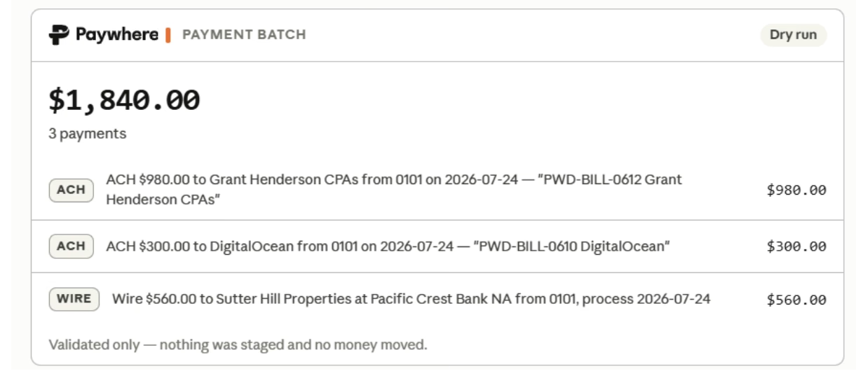
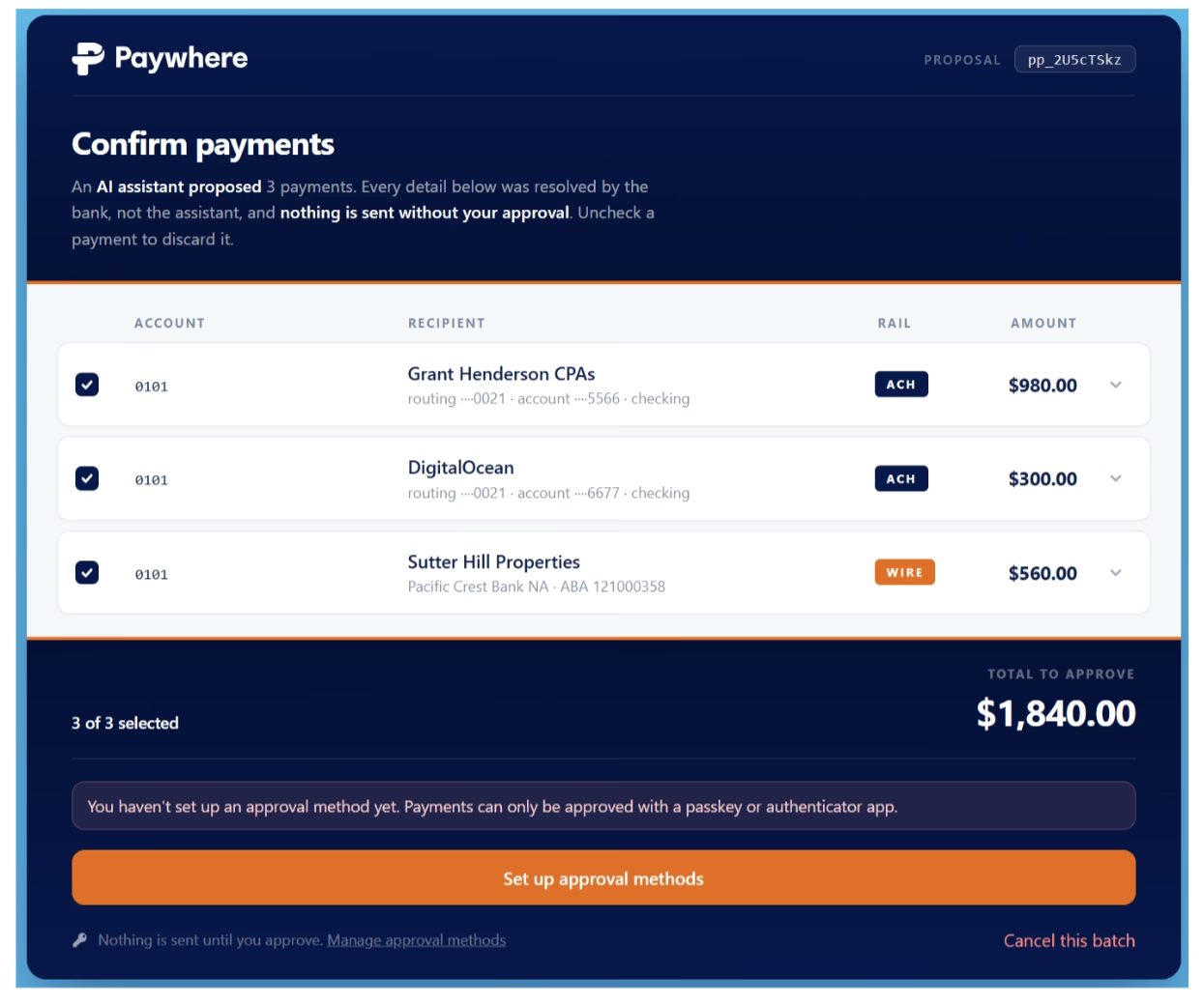
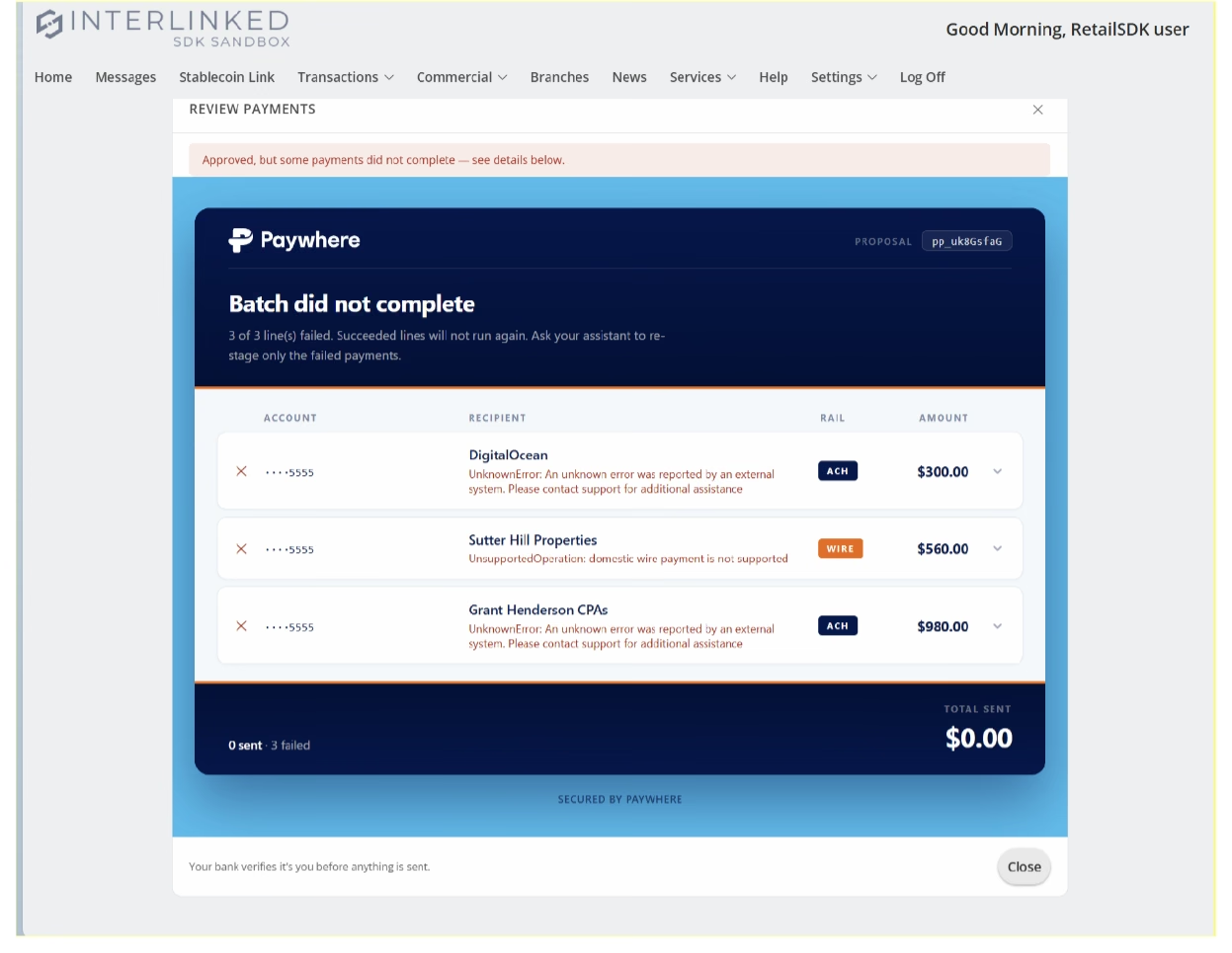
One screen of each kind, as the client sent it, before the redesign.
The portal pages share the design of Paywhere's own, so a bank's colours go through one set of rules, not two. Because they render inside the bank's portal, they add three constraints: a neutral outer edge, fixed widths, and no reliance on the page around them for contrast.
An audit of the client's approval pages filled in the rest:
- 241 loose pixel values, 20 font sizes, 6 weights and no spacing system
- 211 KB of CSS duplicated across 14 pages
- The Approve button, the one that moves money, at 3.12:1 contrast against a 4.5:1 requirement
- Tap targets as small as 28px
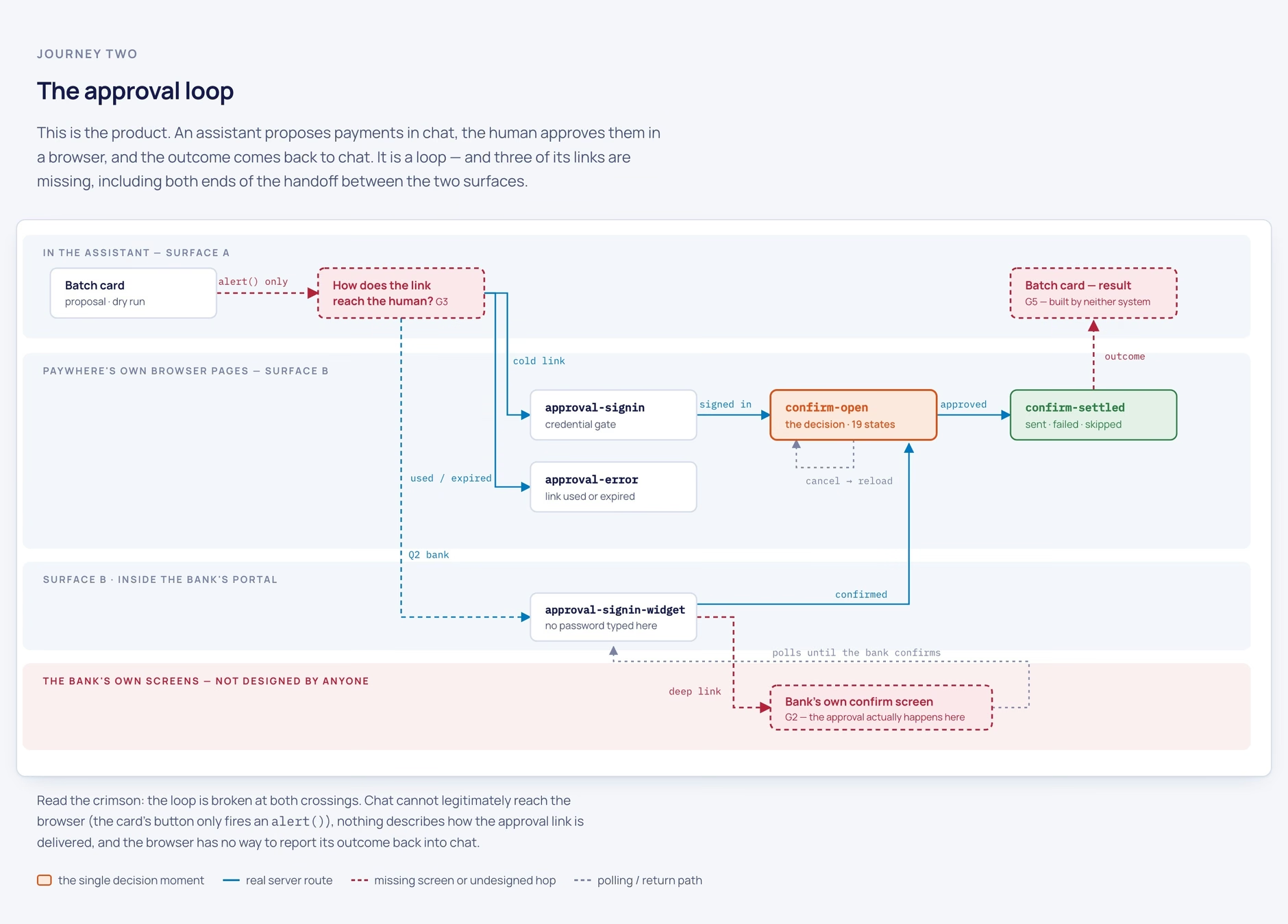
Defining continued after building started. When I went back to find what the screens were missing, the client's design kit had 18 pages and no flow: not one screen linked to another. An agent rebuilt the journey from the server routes in the forms and scripts and found 60 reachable states; the kit drew 23. The approval loop, the heart of the product, was broken at both ends: nothing designed how the approval link reaches the person, or how the result gets back to the chat.
HMW: How might we help a bank's business customer trust a payment an AI proposed, on a screen that can wear any bank's brand without losing legibility or breaking Claude's rules?
Step 3: Ideate
Explore on a canvas the AI can read
I started the directions in Pencil, and agents ported them into Paper. Because Paper takes HTML, agents could render real components onto artboards and change one property across a whole matrix of screens in a single pass. I explored four directions for the approval pages:
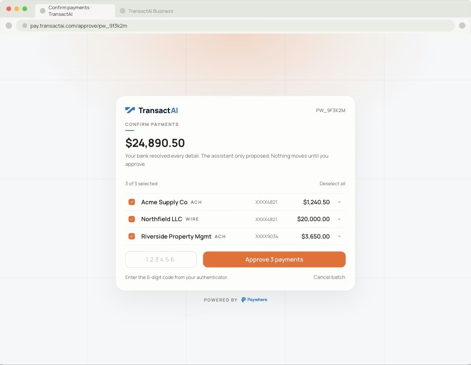
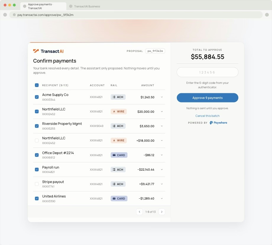
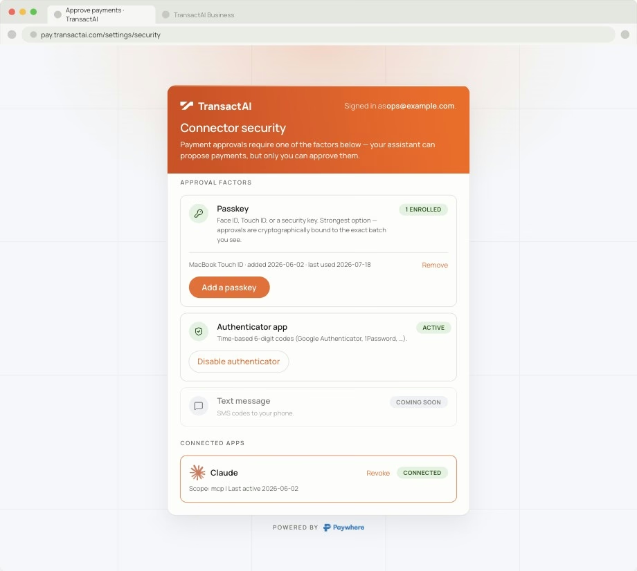
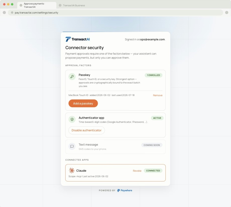
The first two reorganised the page; the other two kept it and changed only the colour. Paywhere wanted as little UI change as possible, and Bindu, their CPO, chose colour on actions: Paywhere blue for the logo, orange only for actions.
A contract any bank can fill in
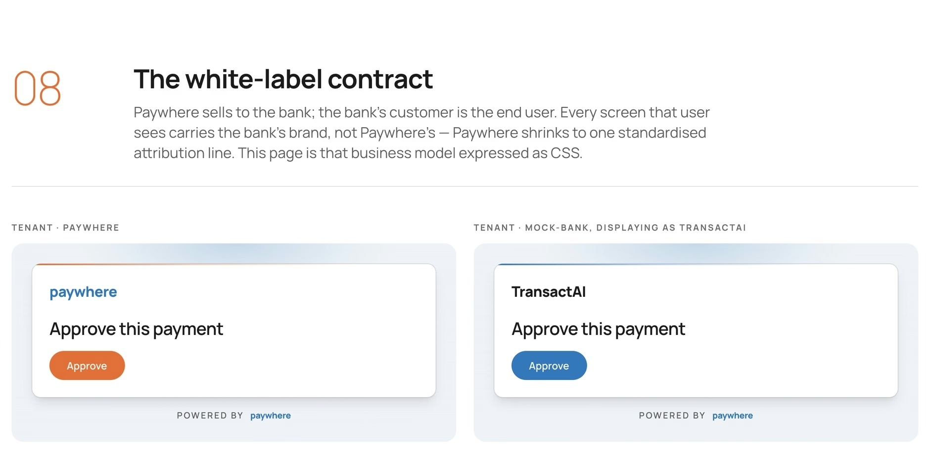
White-labelling became a contract. A bank supplies a logo and two colours: an identity colour that tints the page behind the card, and an action colour for everything inside it. Type, spacing, layout and the "Powered by Paywhere" line stay fixed. No bank can negotiate the attribution away.
The bank supplies
- Logo
- Identity colour, for the page ground
- Action colour, for the card
- Optional dark-mode versions of both
The system keeps fixed
- Type scale and spacing
- Layout and states
- Contrast rules for every colour
- "Powered by Paywhere"
Step 4: Prototype
The prototype was the product
I skipped static mockups for most of the work. Agents first rebuilt the client's pages on one set of tokens:
- Type: 20 ad-hoc sizes down to one role-named scale, 6 weights down to 4
- Spacing: 103 declarations moved onto a 4/8/12/16/24/32 scale
- Corners: 16 hardcoded radii down to 6 tokens
- CSS: 211 KB down to 28.6 KB, 86% less
- Contrast: the worst brand label went from 2.60:1 to 4.67:1, and secondary text from 3.36:1 to 4.81:1
Once the direction was chosen, agents ported it to every screen. Eighteen hand-written pages became one component tree using the client's own file names, so a missing screen became a build error, not a silent gap.
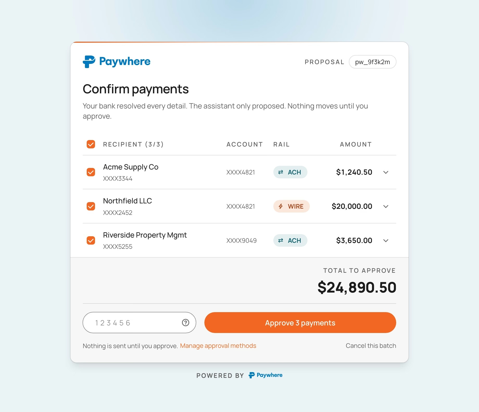
I made one trade-off knowingly. Paywhere wanted their exact brand orange on the Approve button, with white text, which measures 3.13:1 against the 4.5:1 AA minimum. I showed them the cost before they chose it. Every other bank's action colour darkens automatically until it passes; Paywhere's alone is exempt, and deleting one line restores the rule.
How much of Claude to take
This was the hardest call. At first the cards borrowed Claude's colours and type to fit into the chat. Then I went the other way and overrode all 76 of Claude's style variables with Paywhere's values. The final call: the card takes nothing from Claude, not its colours, not its spacing. It reads only whether Claude is in light or dark mode, and the window's safe margins. Every card rendered pixel-identical before and after, in light and dark, which proved the borrowed values had added risk and nothing else.
Step 5: Test
Let the client break it
1. Checks on every build
Every handover build renders each page in headless Chrome and fails on broken tokens, overflow or invisible text, then audits logo contrast and component coverage. When I removed 40 duplicate colour names, it compared 148 rendered pages in light and dark and found 0 differences.
2. Measure, then look
The logo audit said New Horizon Bank's mark would pass on a dark plate. Rendered, its navy wordmark was barely readable: the number and the picture disagreed, and the picture was right. I backed the plate out, changed the script to score a logo's weakest part instead of its average, and stopped trusting any number I hadn't also looked at.
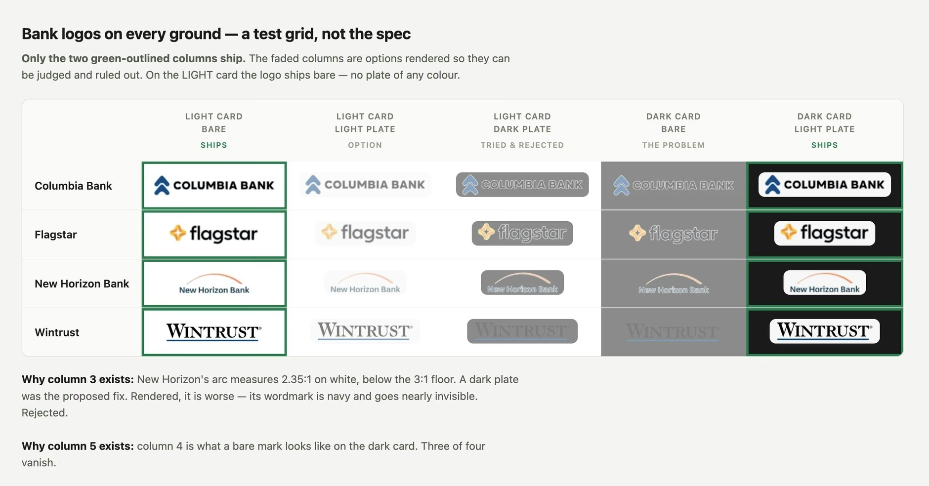
3. The banks nobody renders
The data said four of six brand profiles had near-white colours, so I collapsed the system to one colour. Then the client's brand review sent Flagstar's real navy. The "brand colours" were page backgrounds, not identity colours, and on inspection all six were. I had fixed the two brands I looked at every day; the four real banks were never drawn. I restored the two-colour contract, renamed my field from surfaceColor to logoColor so nobody could fill it wrongly again, and made the build fail on an unusable colour.
4. The client as tester
Brett, Paywhere's CTO, put the stylesheet, unmodified, into 28 of their 45 screens and sent back seven faults. None threw an error. The worst was a stray "*/" inside a comment that closed it early, dropping every brand colour so the page rendered unpainted. I fixed all seven. Their team also ran my control-height check on their own code: every button, field and code input came back at 40px.
My contrast rule also caught a bug in their live product. Their old rule put white text on New Horizon Bank's orange at 2.46:1; the computed rule picks near-black, at 7.51:1. Brett wrote back:
"Your computed-not-assumed button label was worth having, and it caught a live bug."
5. What I still need to test with users
No bank customer used these screens before handover, so the trust they're built for is still an assumption. The first test I'd run: give people who approve business payments a batch the assistant proposed, and see whether they can tell the assistant's suggestion from the bank's checks, and find how to stop it before money moves.
The screens
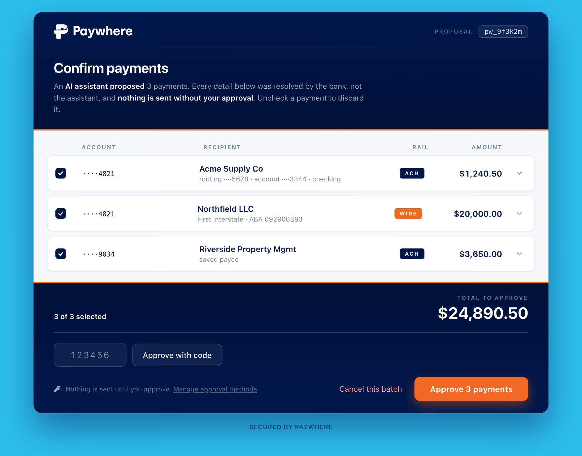
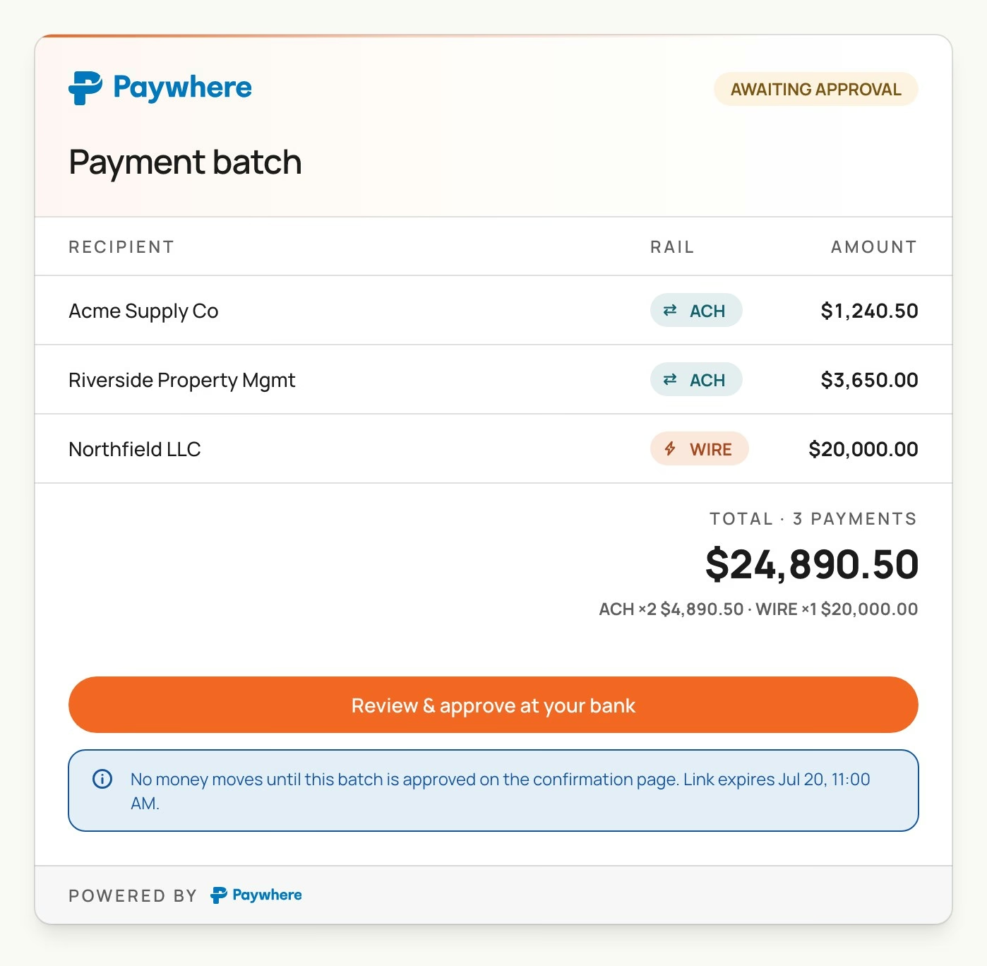
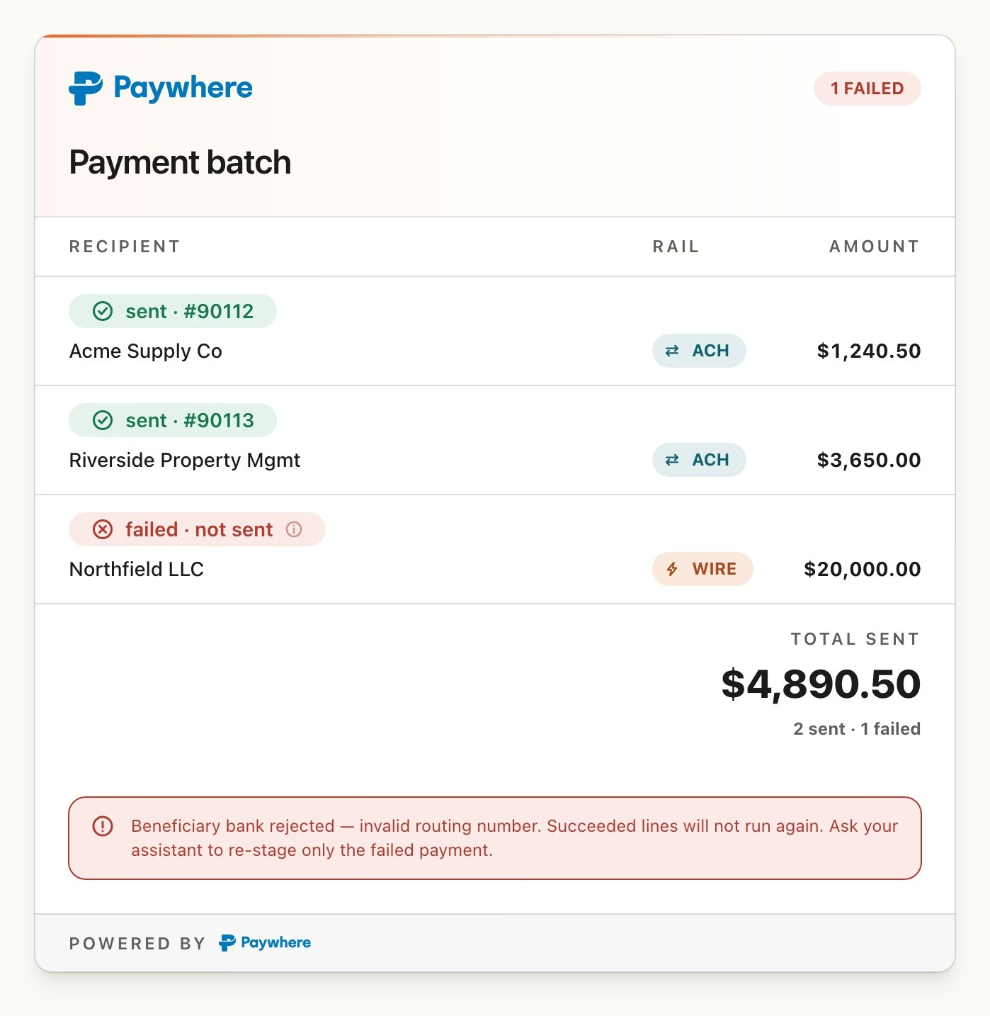
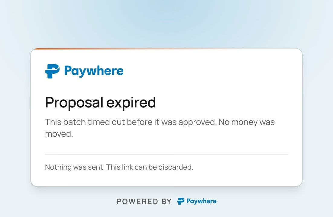
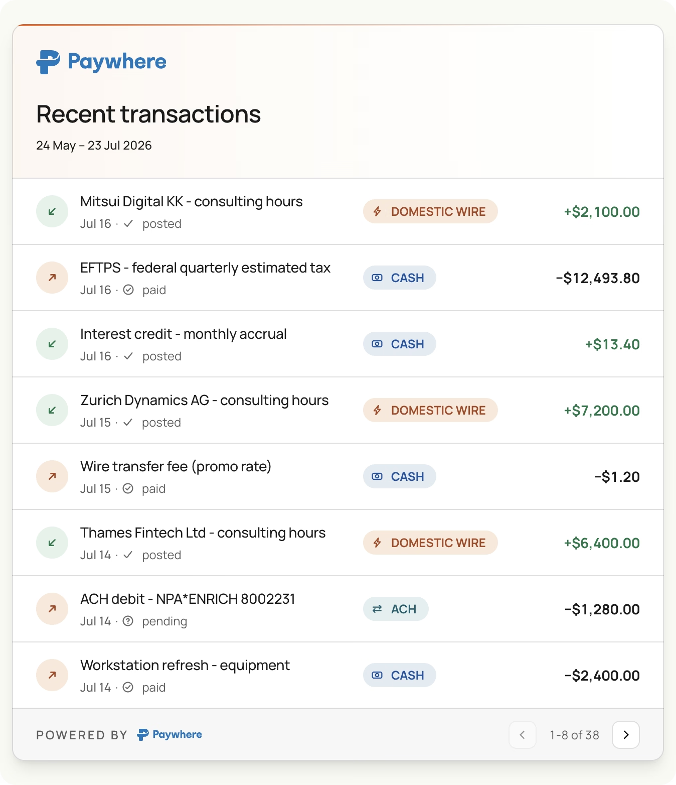
38 screens, each in light and dark. Nine are cards inside a Claude conversation; twenty-nine are browser pages, hosted by Paywhere or inside a bank's portal, where the customer signs in and the money moves. Three are client-approved; the rest went to Paywhere for first review. Here are seven in light mode, rendered from the code I handed over.
Surface A
Inside Claude: nine cards
Surface B
On Paywhere's pages: twenty-nine states
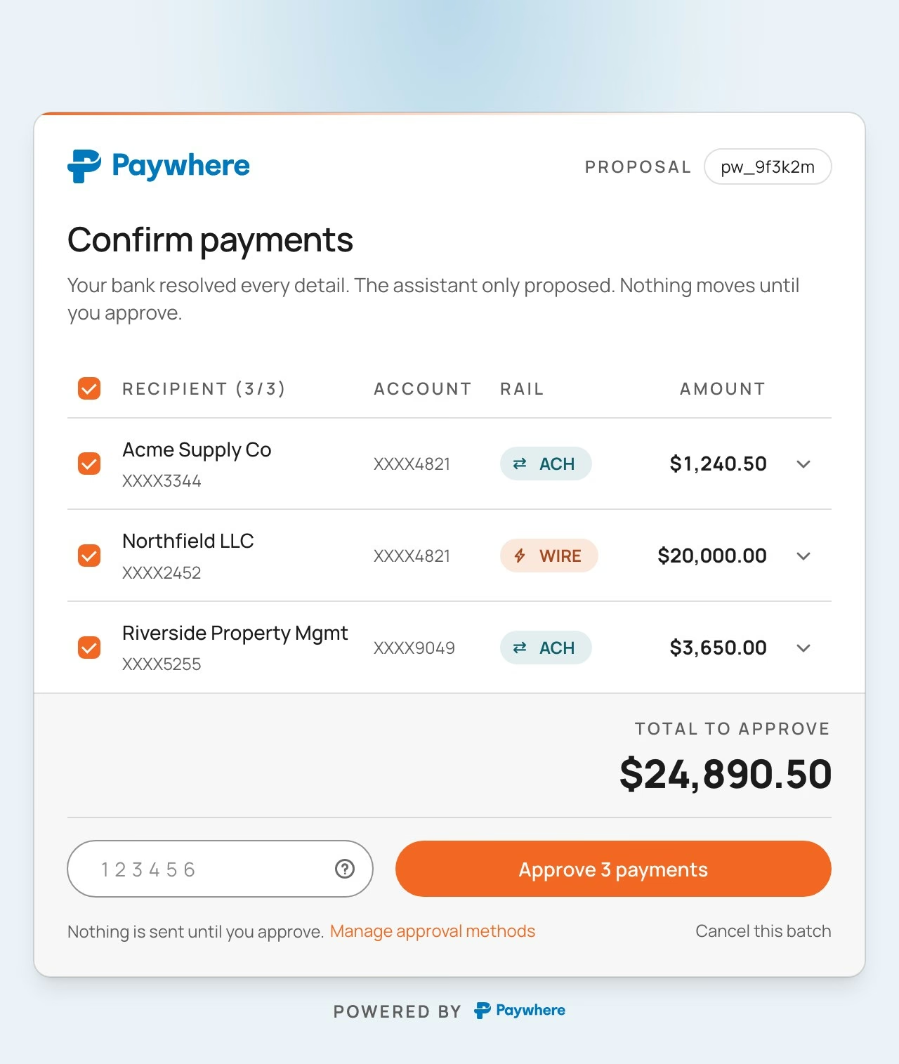
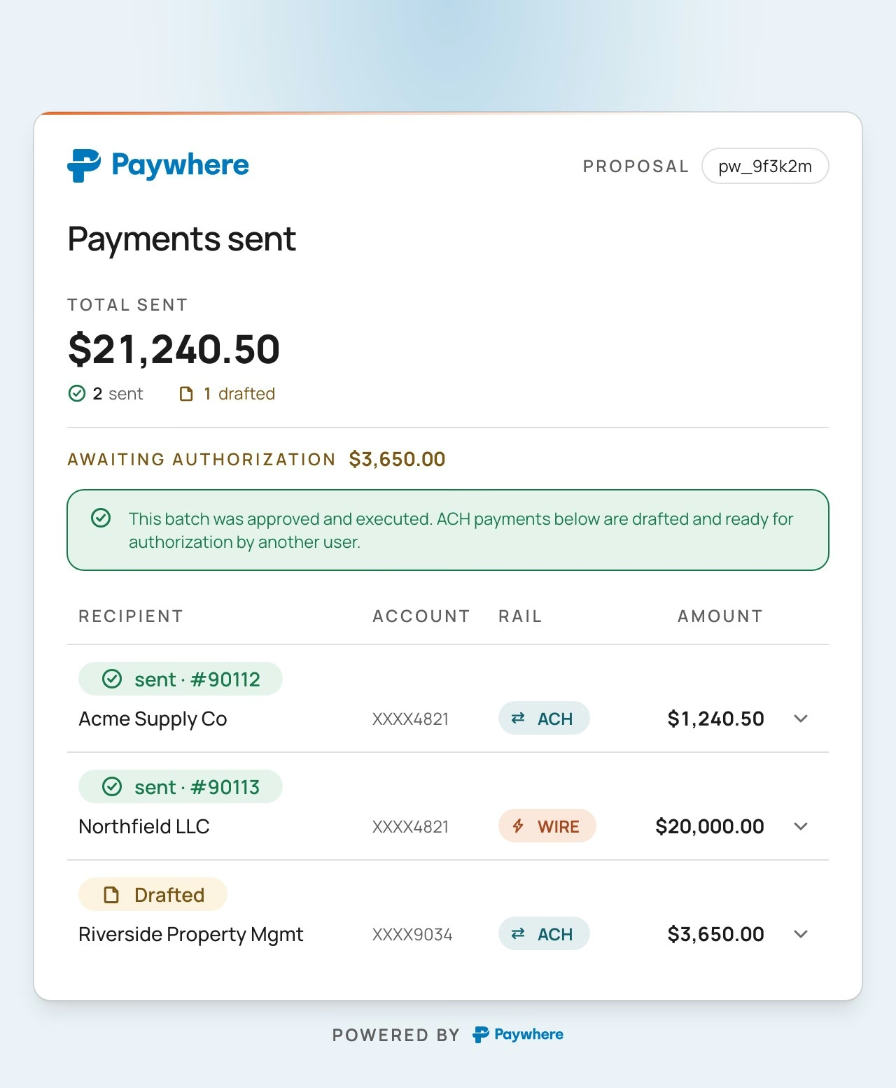
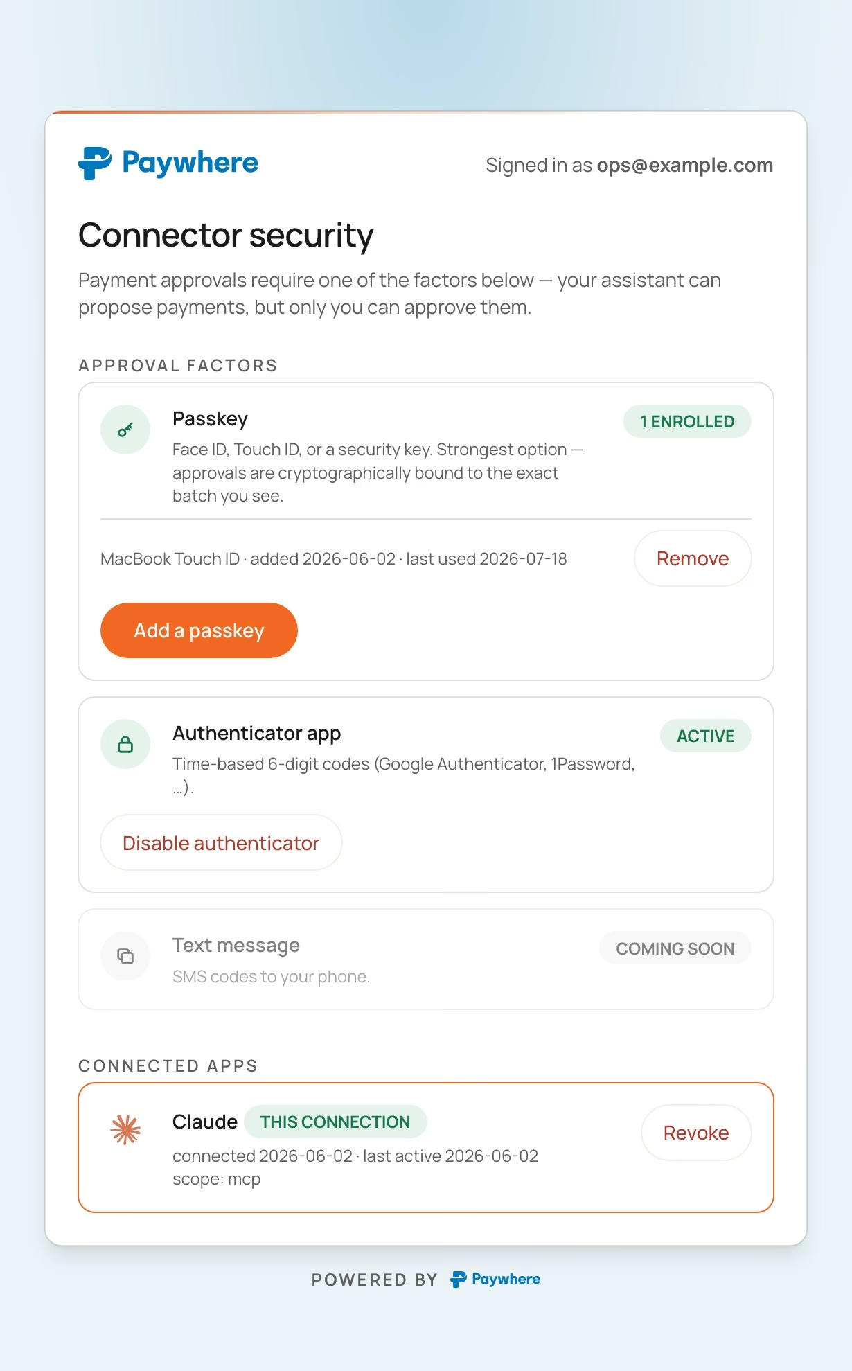
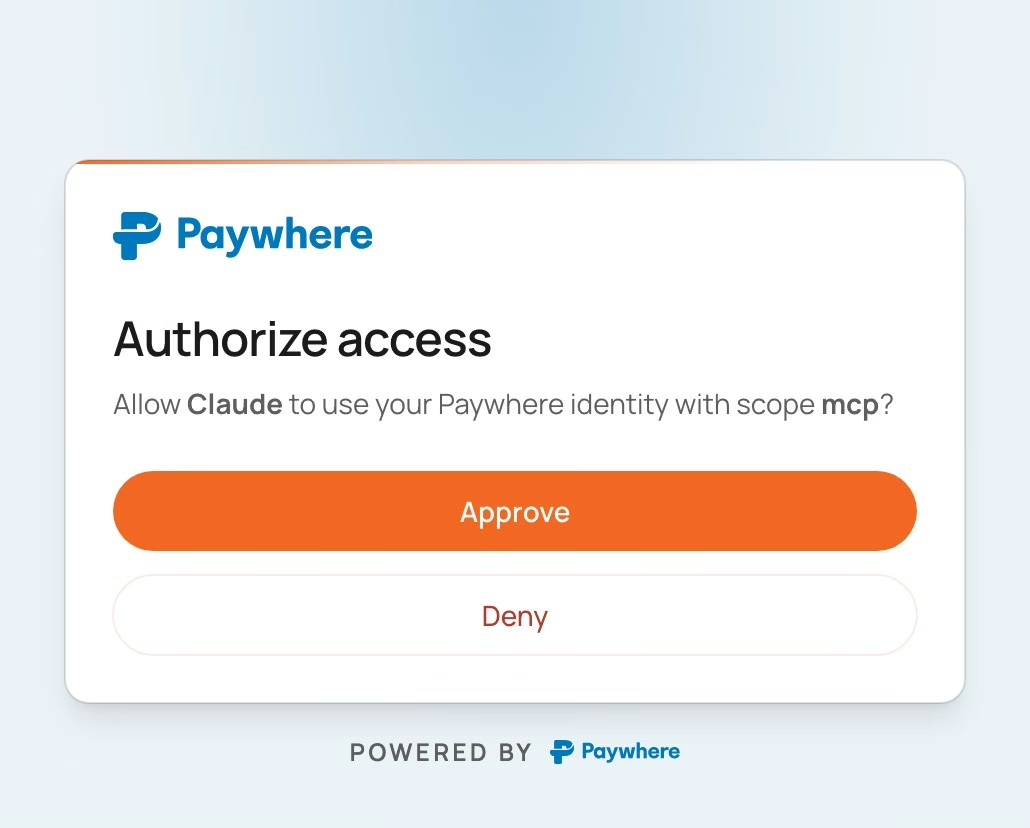
The design system
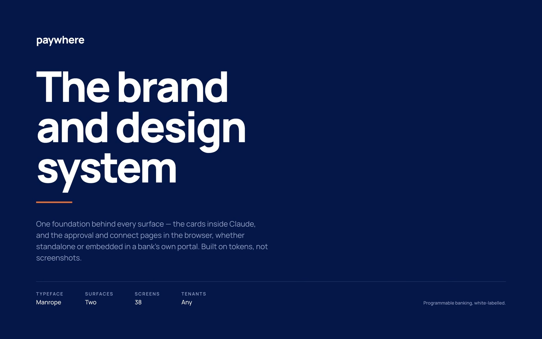
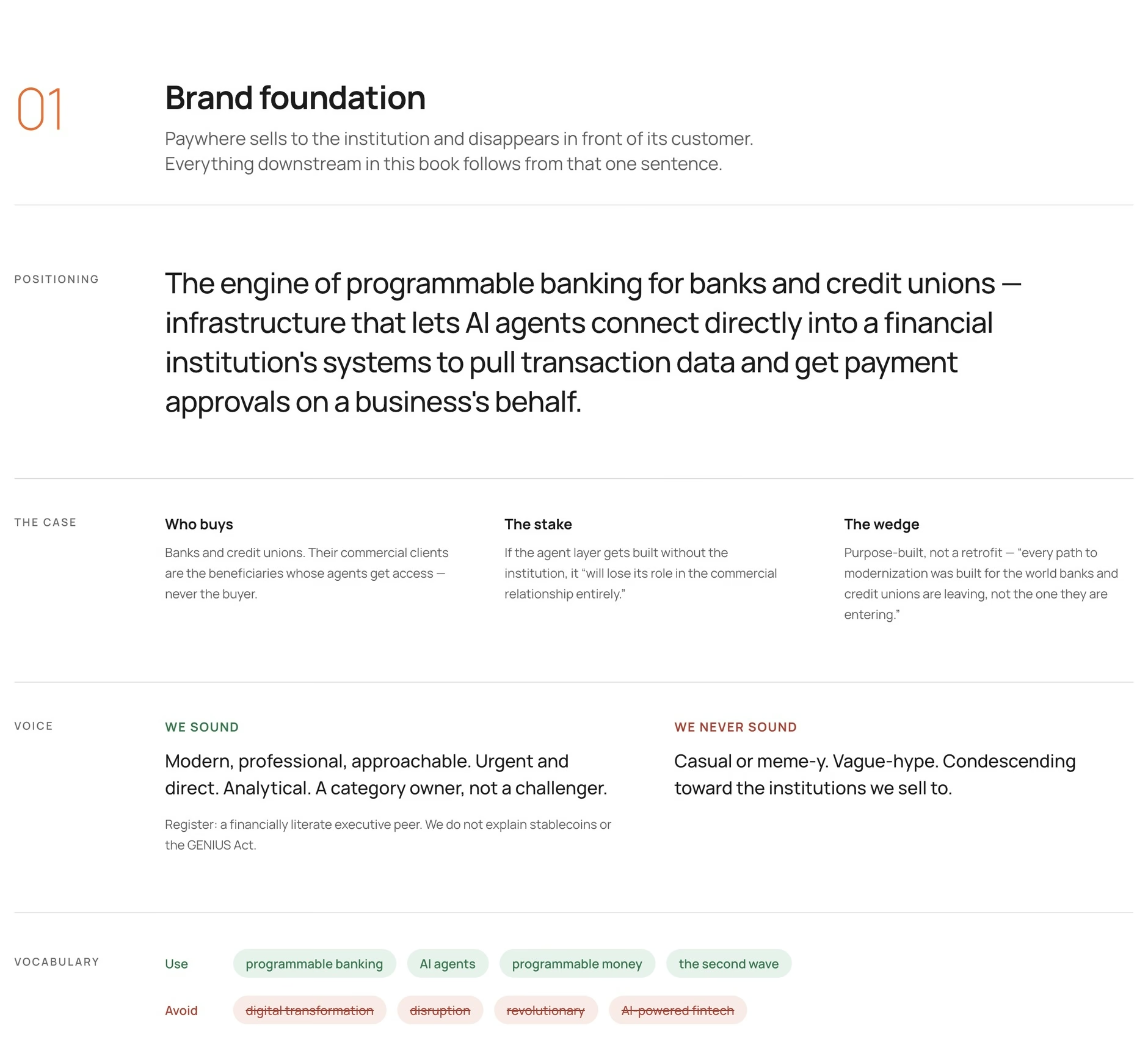
The same system lives as a brand and design book in Paper, so whoever makes Paywhere's marketing works from the same rules as the code. Fourteen pages run from brand foundation through colour, type, controls and the white-label contract, down to atoms, molecules and organisms. Here are four.
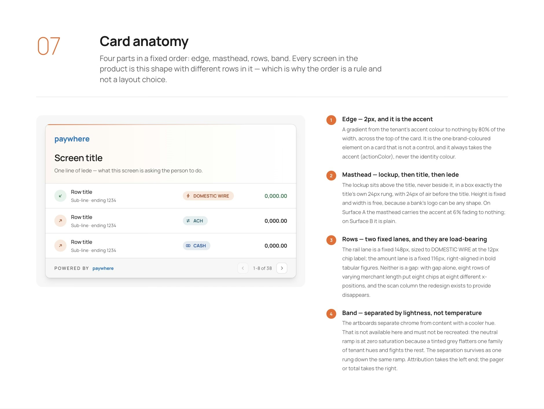
An AI-ready design system
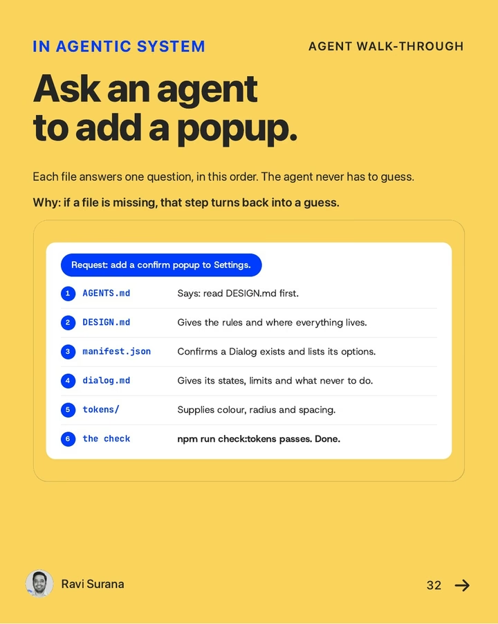
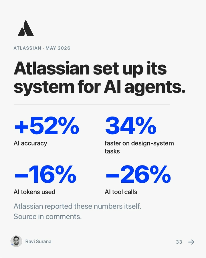
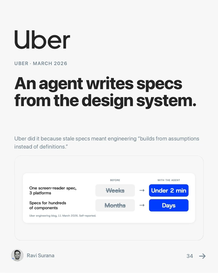
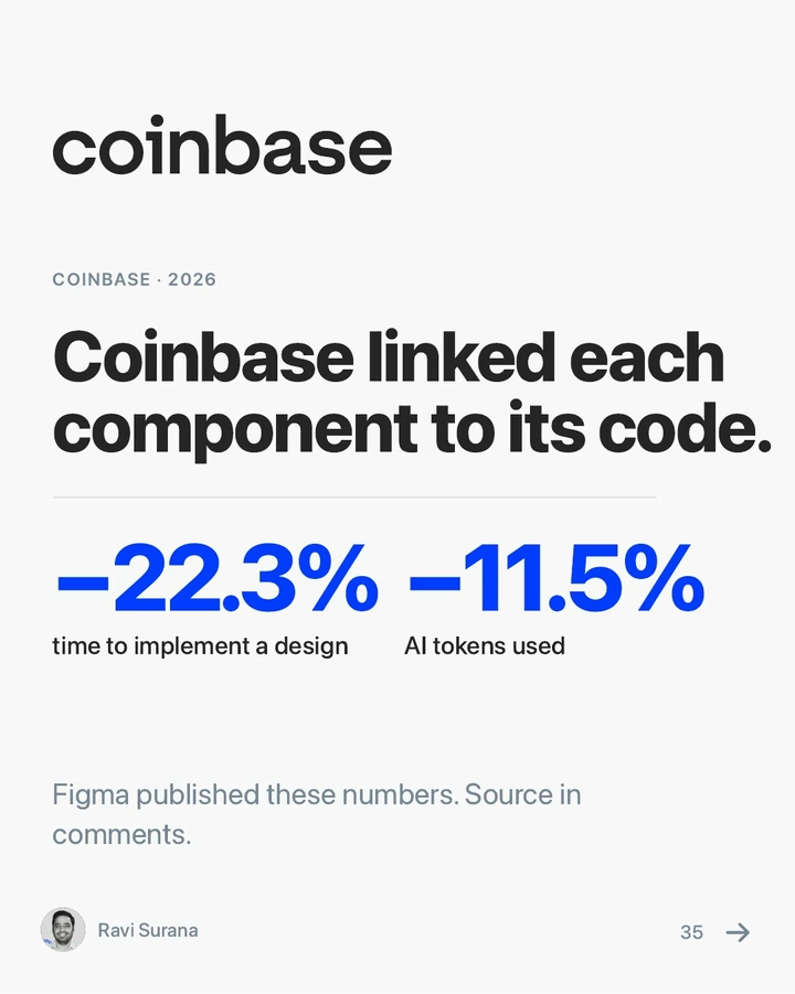
Paywhere planned to build everything on this system after I left: internal tools, customer-facing screens and marketing. So it had two readers: their engineers, and any AI agent working in the code. I didn't know how to keep an agent on-brand, so I spent almost half the project learning how agents work in a codebase, and why they drift. Atlassian's write-up on its own design system helped most. What I built from it:
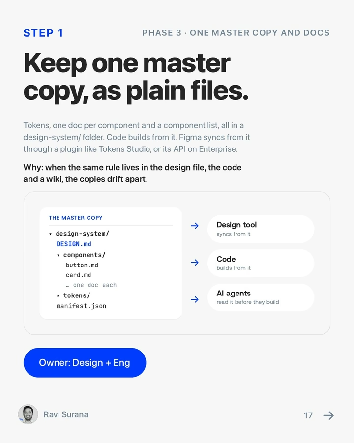
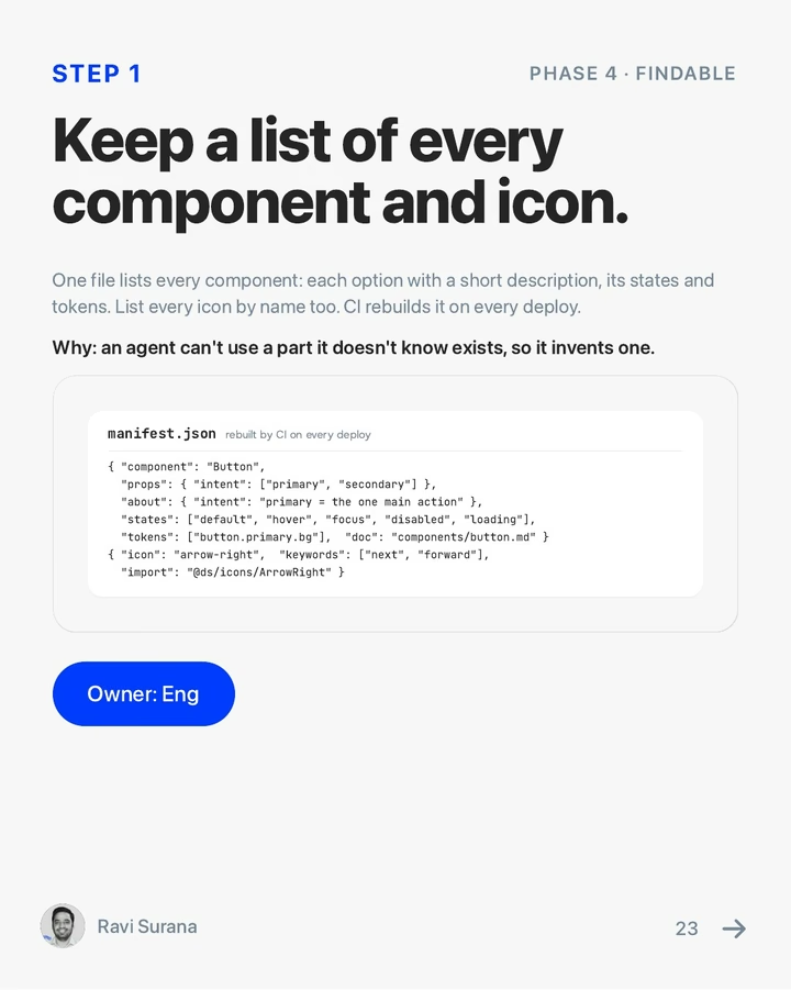
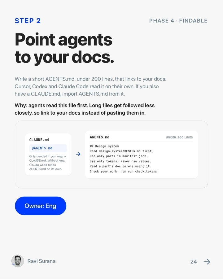
- Files an agent reads before it touches anything: CLAUDE.md and AGENTS.md for the rules, DESIGN.md for the visual system.
- A lookup table that names which file owns each decision, so a change lands in one place instead of five.
- An atomic structure an agent can navigate, from atoms up to whole screens, with each bank kept as a profile of values, not a copy of the code.
- Checks that fail loudly. An undeclared colour token throws no error; the page just renders colourless. So every build renders in a headless browser and fails on a missing token, an overflow or an outside request.
How the code is laid out
- paywhere
- AGENTS.mdThe rules every agent reads first
- .claude
- CLAUDE.mdProject rules for Claude Code
- DESIGN.mdThe visual system, written down
- codebase
- CHANGE-THIS.mdThe lookup table: which file owns each decision
- src
- tokens
- primitivesRaw colours, and the type, spacing and radius scales
- rolesWhat each colour is for, in light and dark
- profilesOne file per bank: a logo and two colours
- contrast.tsThe contrast maths that picks every label colour
- components-new
- atomsButton, pill, rail chip, amount, checkbox
- button.ts
- rail-chip.ts1 · The atom in the strip below
- amount.ts
- … one file per atom
- moleculesLedger row, masthead, pager, total band
- ledger-row.ts2 · Imports the rail chip, amount and badge
- … one file per molecule
- organismsTransactions card, approval panel, auth screen
- transactions-card.ts3 · Imports the ledger row
- … one file per organism
- screensWhole screens, assembled from the levels above
- exportRenders every screen for every bank as static HTML
- serverThe local MCP test bench for Claude


Each level is built from the ones below it, so a new card starts from rows, chips and amounts that already carry the rules, not from raw CSS.
What working with AI taught me
With AI, the harness is the design work
AI can design almost anything once it has the full context. So the work that mattered most was the harness: everything an agent reads before it starts, and guardrails that fail loudly when it drifts.
What an agent reads before it starts
Brand book
paywhere-brand-book.pdf
The code
codebase/src/
Decision log
decision_log.md
Rules
CLAUDE.md, AGENTS.md, DESIGN.md
Lookup table
CHANGE-THIS.md
The agent builds
Guardrails
Checks that fail loudly when an agent drifts
A missing token, an overflow or an outside request stops the run, instead of shipping a page that quietly renders blank.
verify, audit:system, audit:coverage, audit:logos
On-brand output
38 screens in light and dark, on one system
I wrote it up · LinkedIn
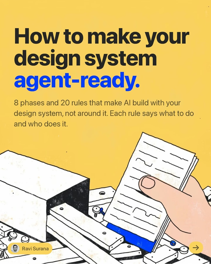
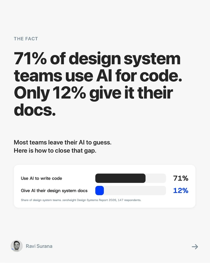
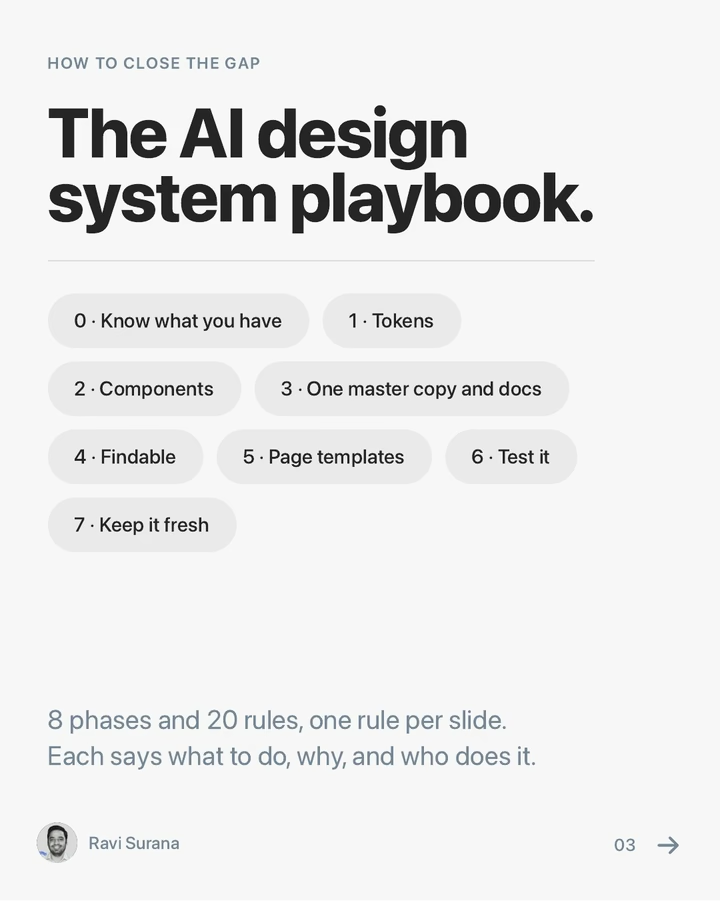
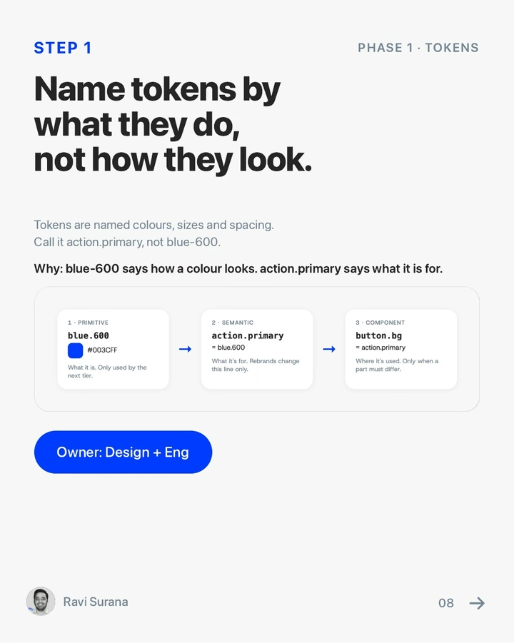
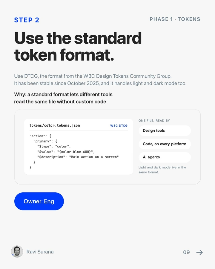
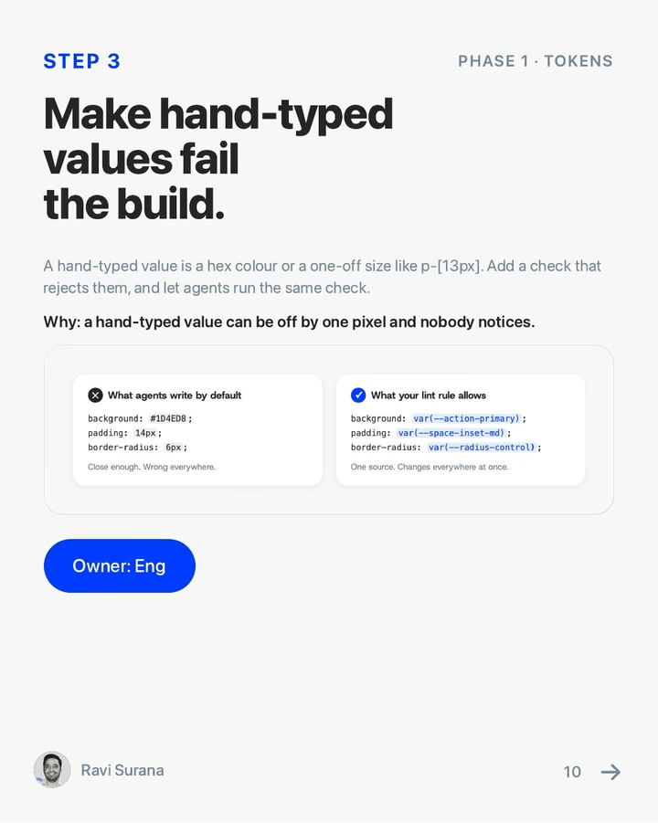
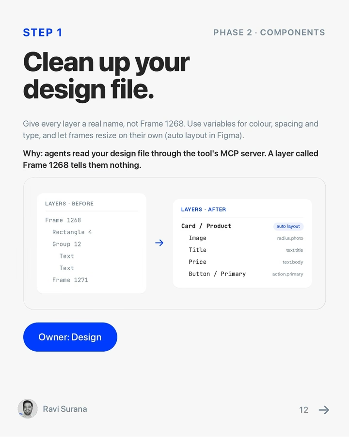
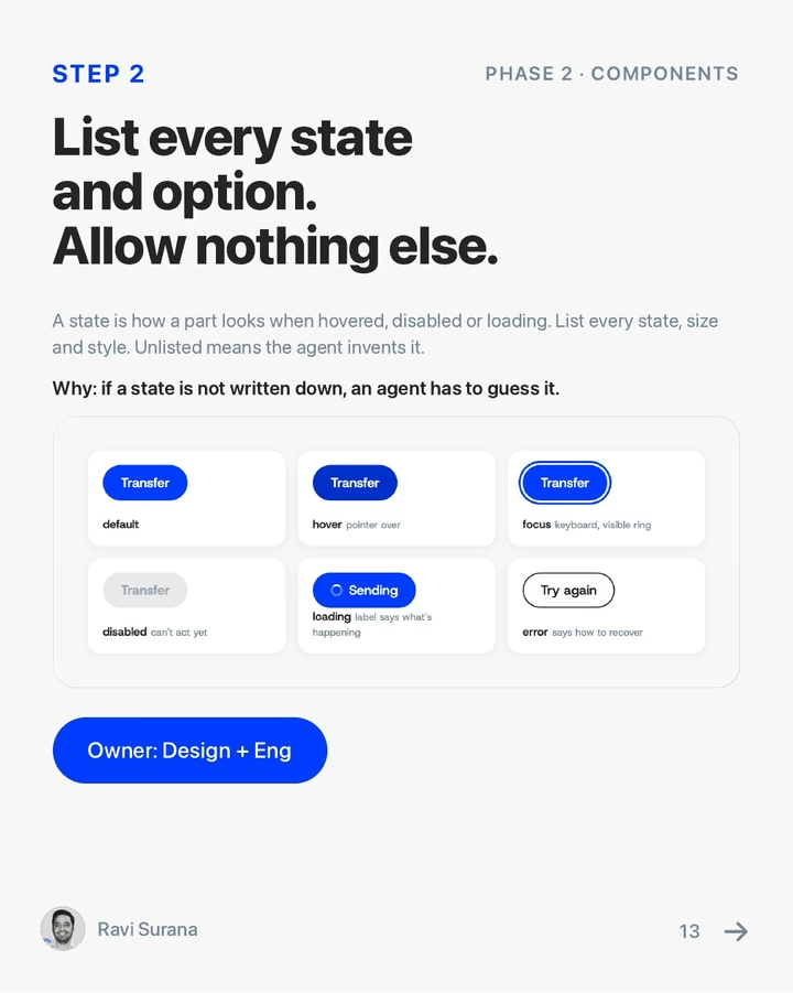
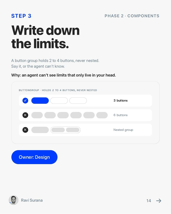
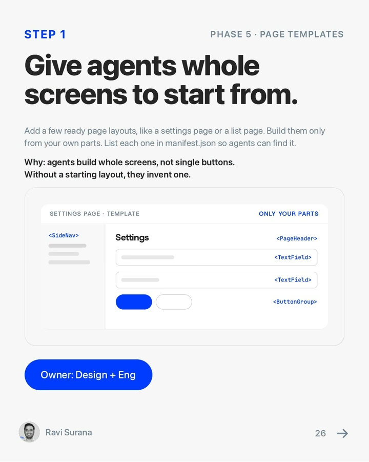
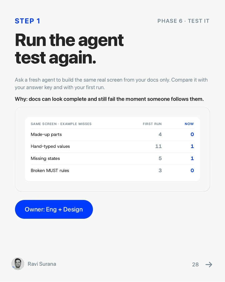
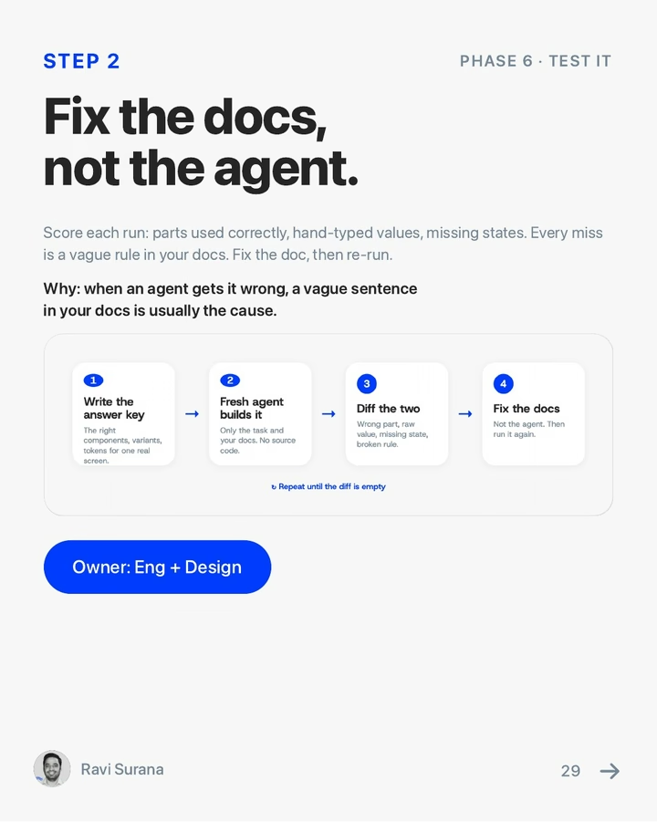
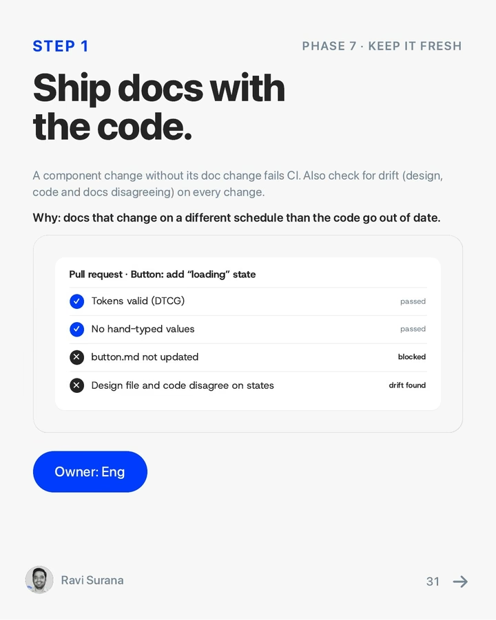
How to make your design system agent-ready
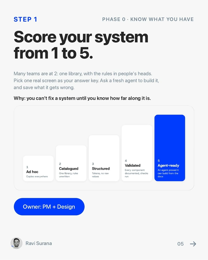
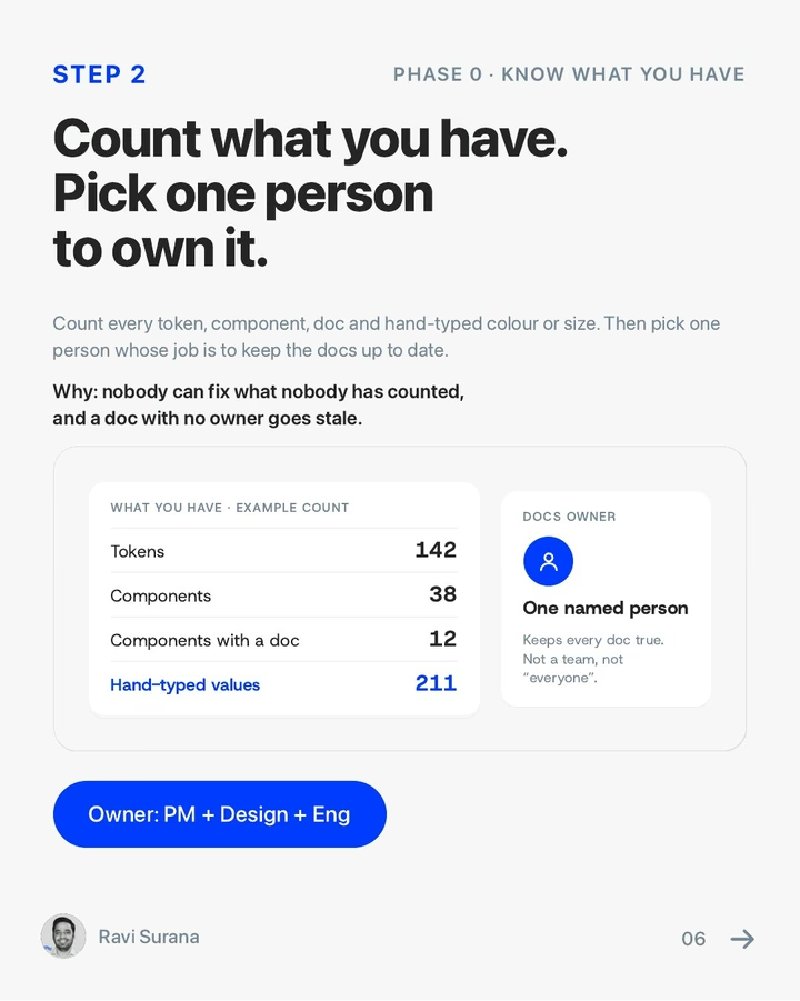
Everything this project taught me about getting agents to build on-brand: 8 phases and 20 rules, each naming who does it.
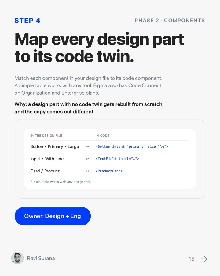
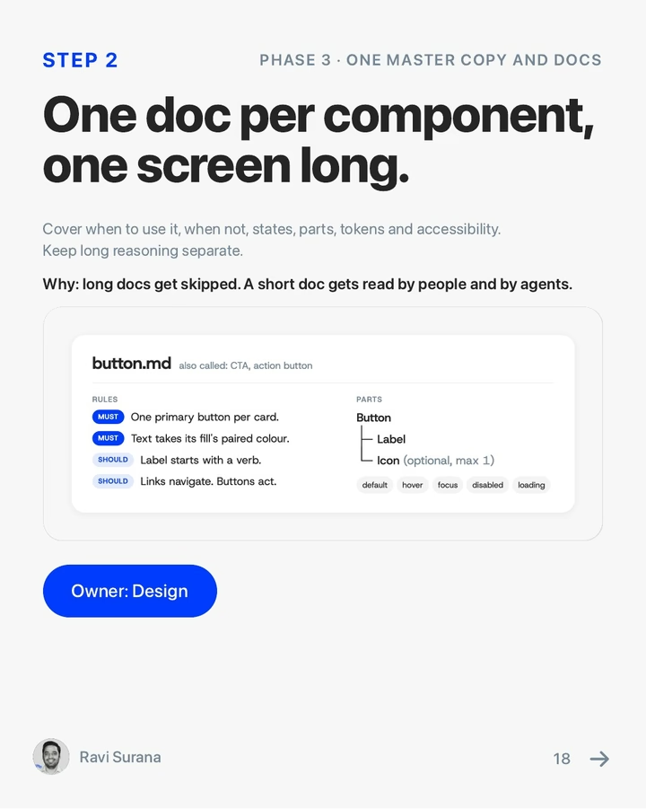
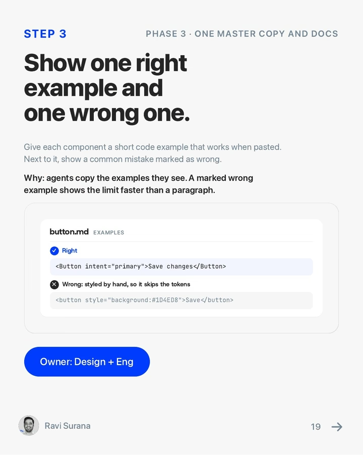
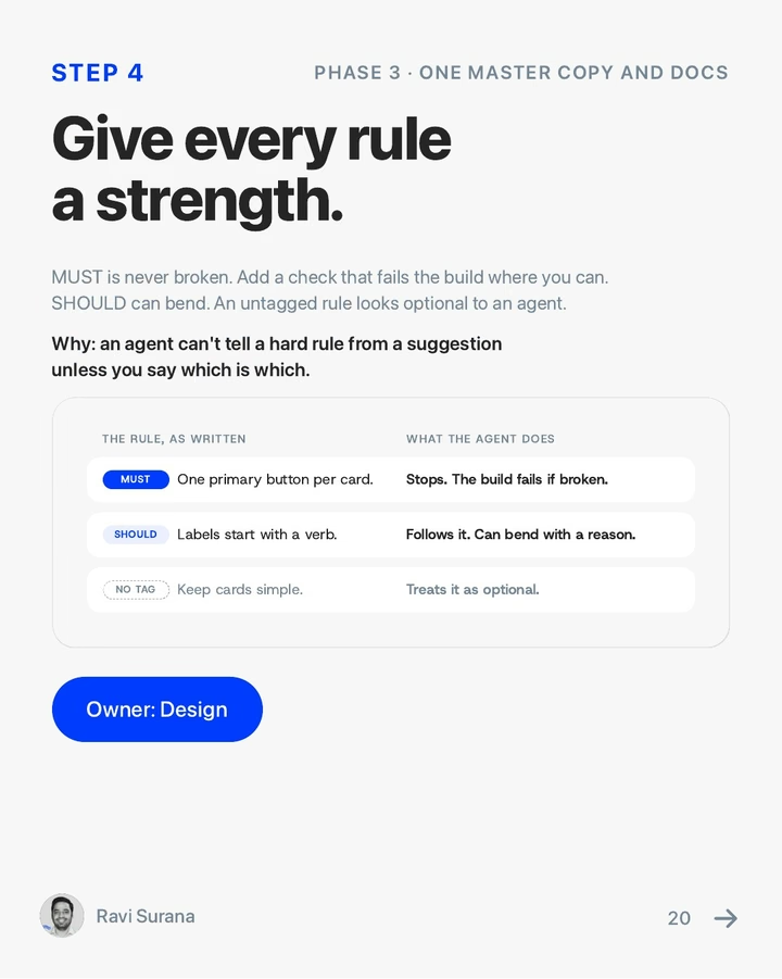
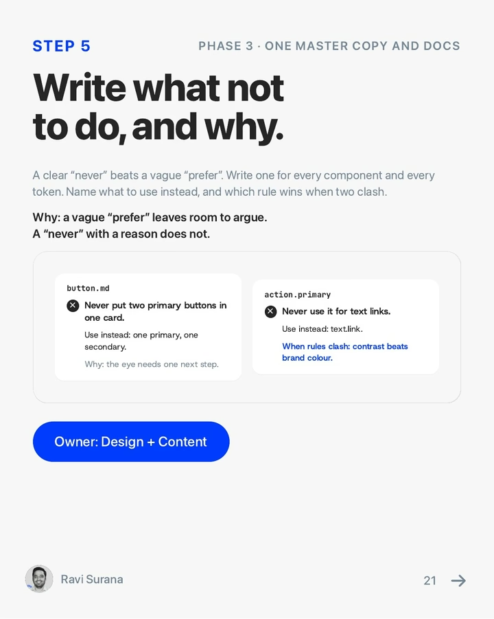

1 / 37
Outcome
The design system is what Paywhere keeps. Their team will build everything on it: internal tools, every customer-facing screen, and marketing materials. Because it is AI-ready, their engineers and AI agents can build on-brand designs without me. The 38 redesigned screens came first.
28 of 45
Adopted as-is
Client screens running the stylesheet unmodified
38
Screens
Delivered in light and dark from one component system
6
Brand profiles
On one contract: Paywhere, the TransactAI demo bank and four of Paywhere's live banks
86%
Less CSS
211 KB of copies became one 28.6 KB stylesheet
60
States mapped
Reachable states found, against 23 drawn in the original kit
4 weeks
To build the system
Against my estimate of 3 to 4 months without my agents. My larger Paystand design system took a year.
Three of the 38 screens carry the client's formal sign-off; the other 35 apply that approved design to screens the client hadn't yet seen in it, and went for first review. Usage numbers are Paywhere's to share, so I measure this project by what shipped: a design system their engineers adopted as it was.