Understanding the Problem
- Did you ever find yourself in a situation where you had to buy more that you wanted to for saving some money?
- Did you ever buy two pairs of the same item in BOGO offer and never used the second one?,
- Did you ever leave empty handed from a shop just because you could not pick different items in a BOGO offer?
Analyzing the old designs
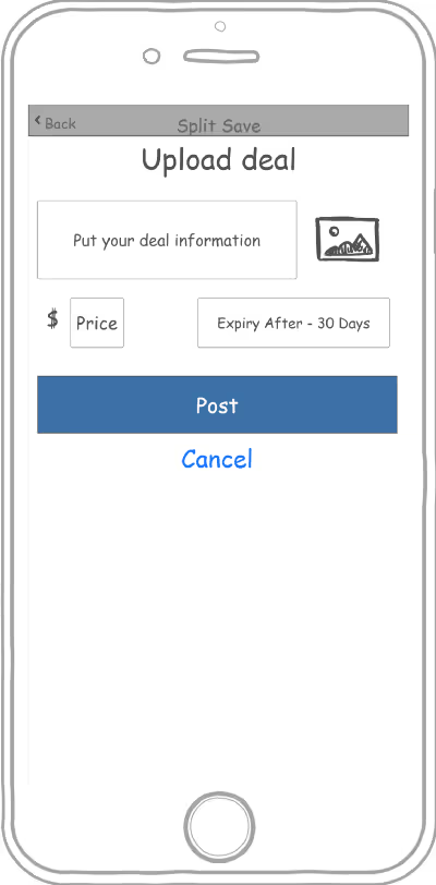
These designs were pretty raw and old. They were designed to validate the idea in the market as quickly as possible. However, we shouldn’t be too much focused on the idea validation and ignore a good and a user-friendly interface that empowers its users to use the product easily and efficiently. There should always be a balance. When a product lacks these basic attributes and does not comply with the basic rules then the opportunity that people might use it goes away. In the old design navigation system, layouts, color choices and font selection were poorly chosen. There was extraneous and irrelevant content on some screens which was distracting and making flow less efficient. So, to learn what was wrong and what was right in the design, the first thing we did was analyzed the old interface and wrote down all the issues based on the user’s suggestions and feedback in the design as well as in functionality so that we could improve them in the new design.
Requirement Gathering
We started with the basic research to collect information about the users and expectation from the business. Stakeholder’s interview was our first step to know about the expectations which would be required to lay the foundation for the product functionality. We prepared a basic questionnaires which included questions like:
- Q1 - What problem we are trying to solve?
Ans - People want offers on the items that they want to buy with maximum benefit without compromising anything. - Q2 - How this product will solve the problem?
Ans - We would create a platform that will help a user to find online/offline deals and people to share the deals. - Q3 - Who are the customers?
Ans - This app will be mainly for USA people, aged between 18-40 years. Users would love shopping and spend a good amount of money on it. They believe in smart shopping and always look for deals before buying anything.
At the end of the this phase we collected enough information from the stakeholders that would help us to get to the next step.
Modeling
This step involved creating personas, process/task flows, developing use cases so that the entire team is on the same page and know all about the product requirements.
Based on the data collected in the previous process, we started creating a persona which would represent our end-user. It consists of all the information about the end-users like, their demography, motives, goals, pain-points, needs, etc. This would keep everyone on the team focused on the real users' requirements and leave less to no place for any assumptions.

After persona was ready, we started brainstorming on user journeys to find the best possible ways for users to navigate through the application and give them best possible experience. See the bird-eye view of the task flow below: